
DIABLO SIN PECADO
Case Study
The Problem:
For this project, I was tasked with developing the branding for a low-calorie beverage company (Diabla sin Pecado, later changed to “Diablo sin Pecado” meaning, “Devil without sin”) specializing in beer, hard seltzer, and hard cider. I designed a distinctive logo and crafted label designs that align with the brand’s identity. To showcase versatility, I created three unique versions for each product, complete with high-quality mockups. Additionally, I designed a marketing asset to support the brand’s promotion and ensure a cohesive visual presence across platforms.
The Solution:
My task as the designer was to create a cohesive and effective brand identity. I first defined the target market and outlined key deliverables. I then brainstormed ideas and developed multiple thumbnails, sketches, and rough concepts. From there, I designed a logo and label for the Mexican-style lager, as well as a hard seltzer and a marketing item tailored to the audience. After refining each element, I ensured the final products were visually compelling and aligned with the brand’s identity.
The Target Market:
Health-Conscious Drinkers – Beer lovers who prioritize lower calories without sacrificing flavor.
Young Professionals (Ages 25-40) – Urban consumers who appreciate high-quality, culturally inspired beverages.
Latin American & Culturally Curious Consumers – Those drawn to Mexican traditions, flavors, and aesthetics.
Craft Beer & Light Beer Enthusiasts – Drinkers looking for a refreshing alternative to mainstream light beers.
Outdoor & Socially Active Individuals – People who enjoy beer at social gatherings, festivals, and casual outings.
The Process
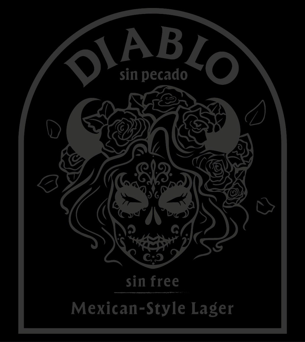
To successfully develop all brand deliverables, I focused on the company’s flagship product, a “Mexican-Style” lager. The design process began with 50 thumbnail sketches, which I refined down to four rough concepts. From these, I selected a Día de los Muertos-inspired calavera illustration featuring horns and flowing, elegant hair. This design not only highlights my skills as an illustrator but also captivates and intrigues consumers, reinforcing the beer’s distinctive and sophisticated aesthetic.
50 Thumbnails, 4 Roughs

Initial Logo, Label Design and Mock Up


Revisions and Finished Product

After receiving feedback from peers, instructors, and industry professionals, I refined the label to its final version. The name was changed from Diabla to Diablo, (“Diablo Sin Pecado” means “Devil without Sin”) and the red typeface and color were adjusted for improved readability and accessibility. The label’s arched design was inspired by traditional Mexican adobe architecture, adding authenticity to the brand’s aesthetic.
The two additional flavor labels were designed with a cohesive theme, ensuring they clearly belonged to the same product line. Each was professionally rendered into high-quality mockups, and custom top-of-the-bottle labels were created to enhance the packaging.
To support brand awareness, I designed a marketing coaster intended for distribution in bars and restaurants frequented by the target audience. This strategy aimed to increase visibility and engagement, reinforcing the brand’s presence in key social spaces.
